Phia
Sep '25 - Dec '25
Overview
From September to December 2025, I worked as a Growth Design Intern at Phia, a fashion discovery iOS browser extension. During this time, I focused on three key growth levers: reducing extension churn, increasing user activation, and driving monetization. I went through a number of iterations and rounds, ran A/B tests, and dug through Mixpanel data to better understand user behavior and pain points. By the end of my time there, I had redesigned core user journeys and contributed to establishing a cohesive design language that eventually evolved to define the entire product experience.
Onboarding Redesign
The Challenge
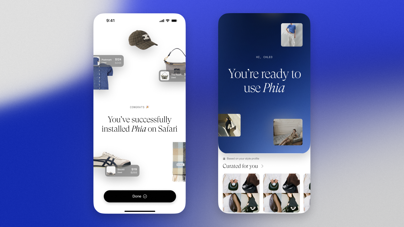
Phia's onboarding flow wasn't converting users effectively. Without a clear design system or cohesive visual language, the experience felt disjointed and failed to set proper expectations for the extension's value.
Research & Discovery
I began by auditing competitor iOS browser extensions, to analyze what made their onboarding experiences successful or unsuccessful. From this, a few key patterns emerged:
Progress indicators (breadcrumbs) tended to reduce abandonment, by showing users where they were in the flow.
Early personalization in an onboarding increased engagement and relevance by getting users more invested in the flow.
Copy optimization significantly improved click-through rates by making the value proposition more clear.
Design Process
I approached the redesign in two phases:
First, quick wins: I reskinned the existing flow with improved copy, progress indicators, and minor UX refinements, as things that could be shipped easily but still resulting in a big impact.
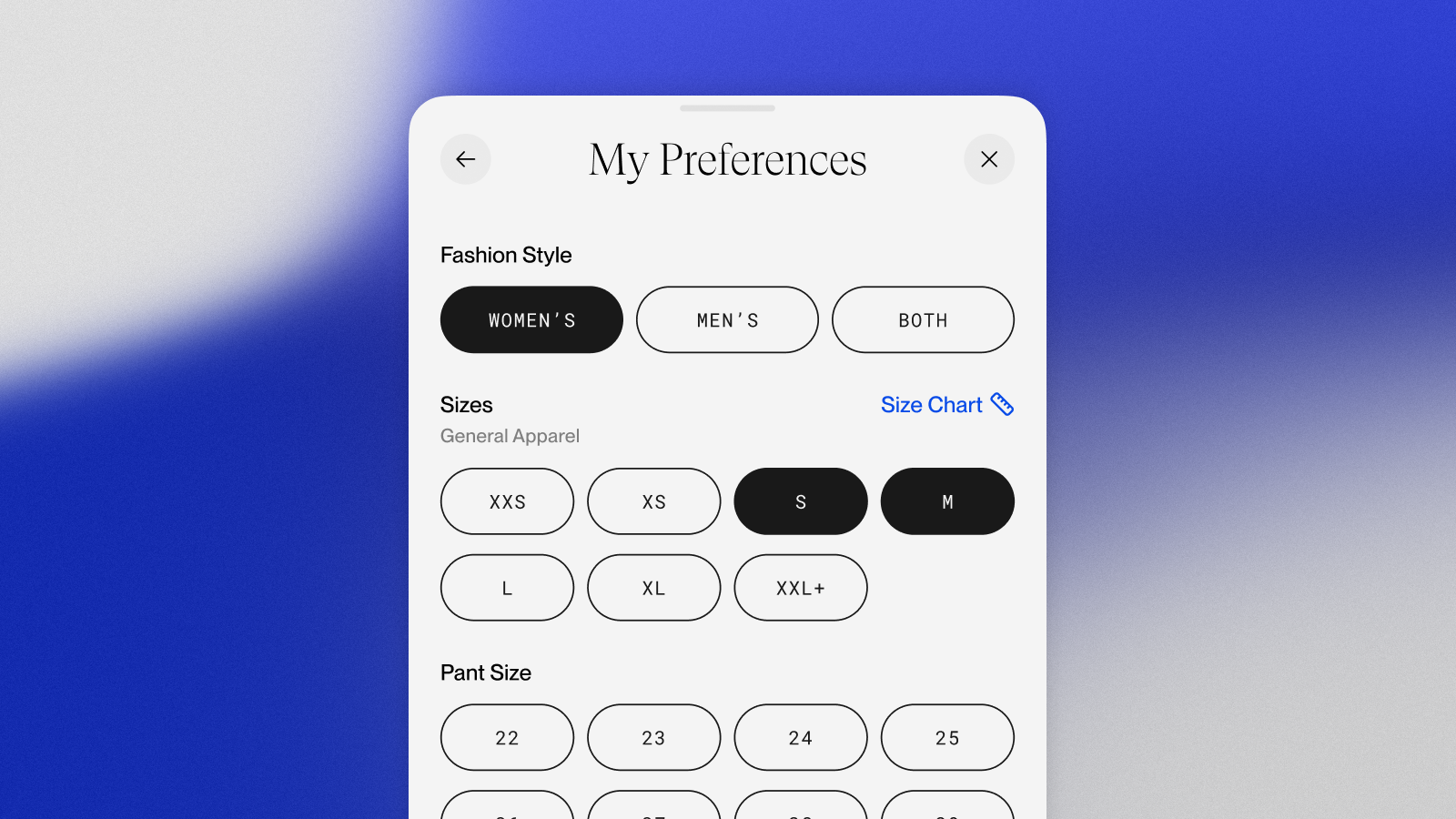
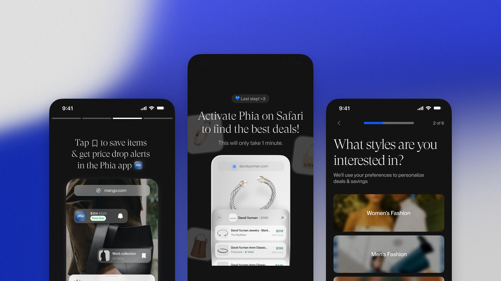
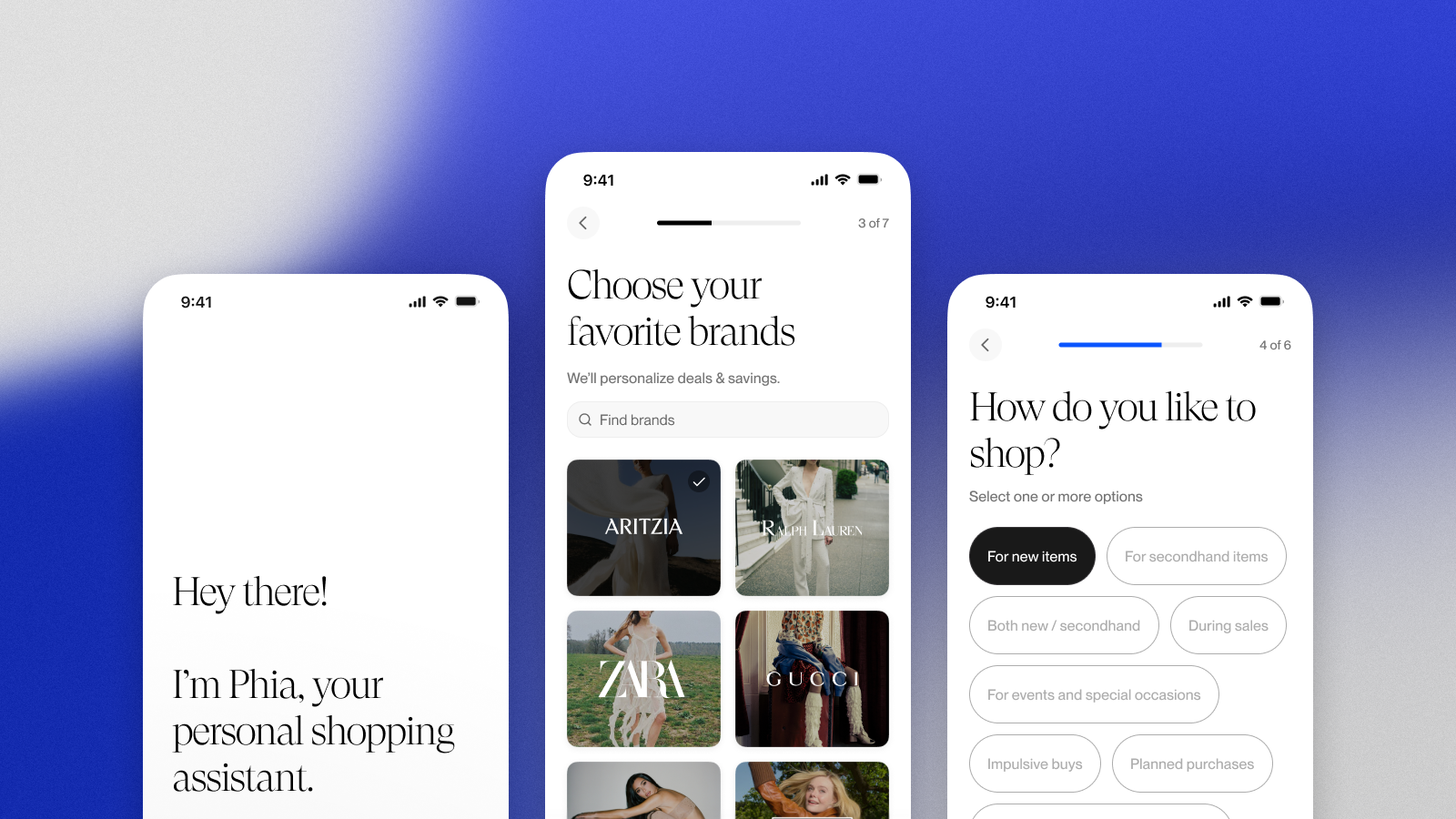
Next, a full redesign: I built a completely reimagined onboarding experience with personalization, updated styling, and a cohesive visual language
Iteration & Tension
Some of the more high-impact screens went through dozens of iterations as I navigated a tension between the founders' desire for flashy marketing moments and trying to craft the best possible user experience. Without an existing design system, each iteration began to diverge visually, which created inconsistency with the rest of the app.
But, I started to view this challenge as an opportunity: I developed a new design language during the onboarding work that eventually became the foundation for the entire product. New patterns for typography, color usage, component styling, and interaction design emerged organically and were systematically applied across Phia.
Activation Optimization
The Problem
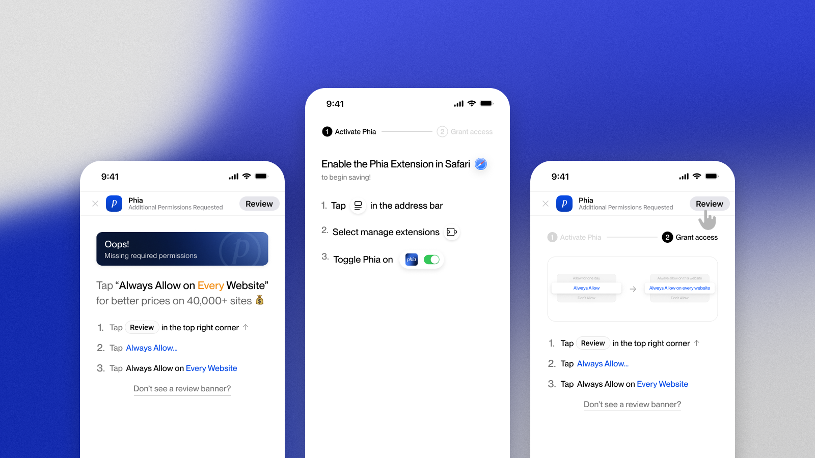
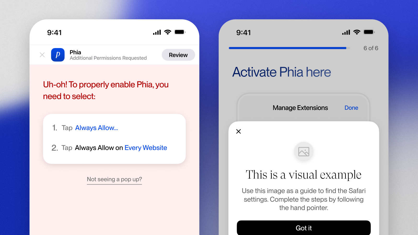
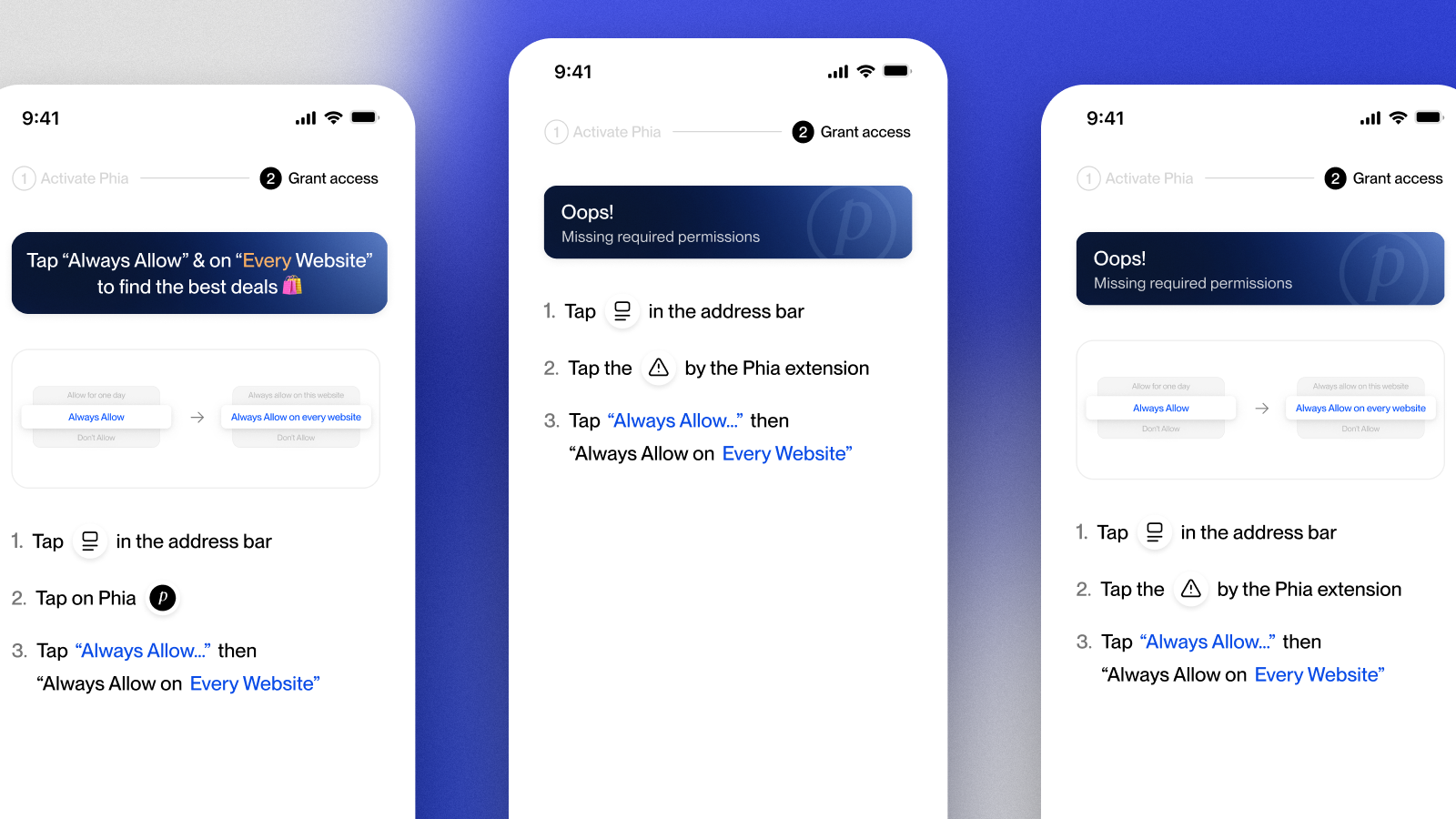
After completing onboarding, users were directed to Safari to activate the extension, but activation rates were concerningly low. Many users exited prematurely or failed to activate correctly, which created a critical drop-off point in the user journey.
Investigation
Through A/B testing and PostHog session recordings, I was able to identify the core issue: users were confused during Apple's system modals and frequently selected the wrong option, which prevented successful activation.
Since we couldn't modify Apple's native modals, the solution had to come from improved preparation on our end -- clearer copy and better visual guidance on the activation screen itself.
Design & Testing
Activation then became a P0 priority across the company. I started to run weekly experiments to test different approaches to activation, including:
Different copy approaches to set clear expectation.
Visual guides showing exactly what to tap.
Step-by-step instructions vs. single-screen explanations.
Edge case handling for incorrect inputs and session timeouts.
Each iteration was informed by data, and we systematically improved activation rates by making the required user actions crystal clear before they entered Safari.
Monetization & New Features
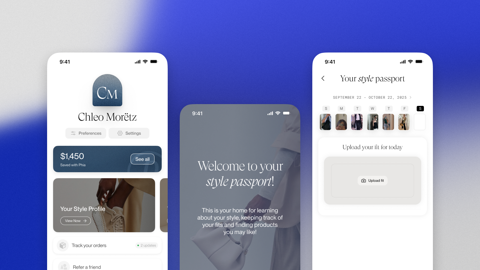
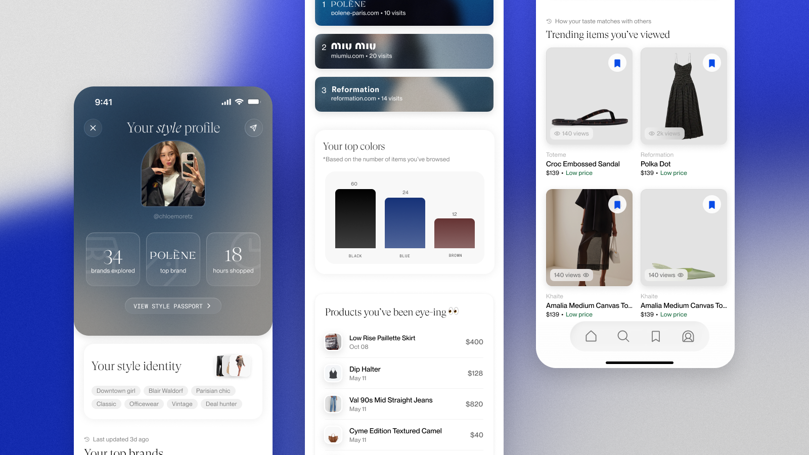
Style Passport
I also had the opporuntity to work on the design of "Style Passport," a comprehensive feature set aimed at increasing engagement and shareability while driving monetization. The feature combined three main elements:
Style Profile: An AI-powered analysis of the user's fashion preferences and aesthetic, surfacing personalized insights.
Outfit Gallery: A space for users to upload and curate their outfits, with social sharing built in to increase virality.
Shopping Profile: A year-round "Spotify Wrapped" experience showing users their shopping patterns, favorite brands, spending insights, and style evolution.
The goal was to ultimately create a shareable, engaging feature that would increase user retention while also creating natural upsell opportunities for more premium features that were planned.
Additional Work
Beyond these core projects, I also contributed across multiple touchpoints:
Onboarding animations: I created motion design for key onboarding moments to increase delight and clarity,
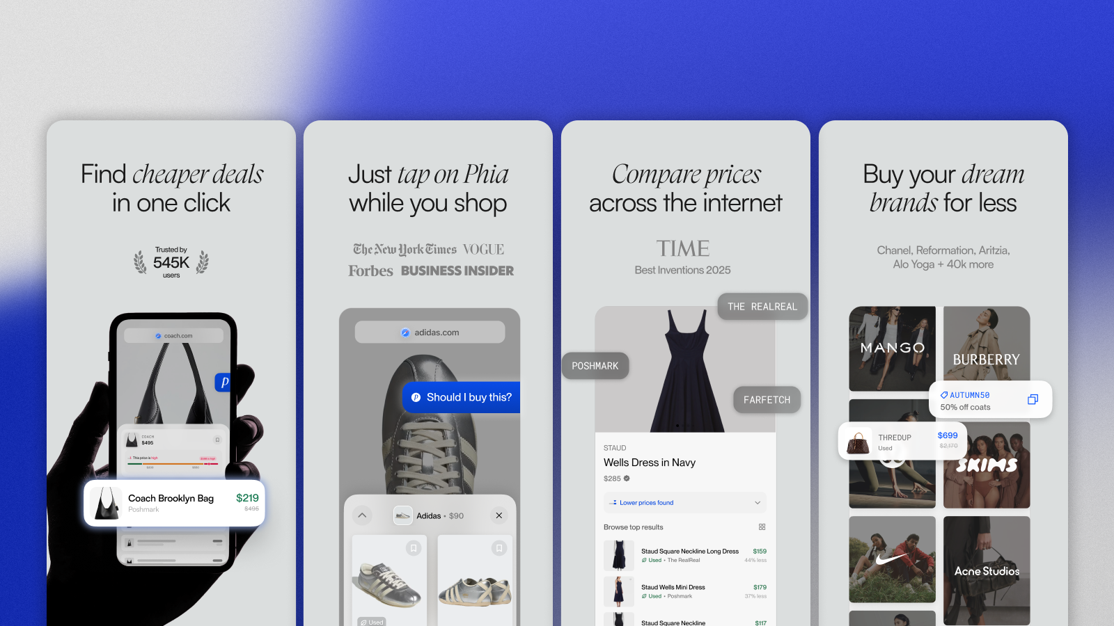
App Store optimization: I redesigned all App Store screenshots to improve conversion from store page to install.
Growth features: I designed referral flows, email campaign templates, and other retention-focused features.