Groq
May '25 - Dec '25
From May to December 2025, I worked at Groq as a Product Design Intern on the GroqCloud platform. Over the course of 8 months, I led the creation of a comprehensive design system for the entire console frontend, standardizing visual language, reducing color conventions from 30 to 14, and building a scalable component library. Alongside this foundational work, I had the opportunity to design and ship multiple platform features, from LoRA management interfaces to mobile-optimized modals, while contributing directly to the codebase.
Overview
As GroqCloud scaled rapidly, features were being built and shipped every week, but with no standardized design system, incosistent UI patterns and styling began to emerge. Colors were duplicated under different naming conventions, components had multiple implementations, and there was no single source of truth for design decisions. To solve this problem, I proposed building a comprehensive design system that would standardize the visual language, reduce color conventions, and build a scalable component library.
Design System
I broke the design system into two phases: Foundations, which included colors, typography, icons, spacing, and elevation; and Components, which were reusable UI elements from simple buttons to complex inputs.
Foundations
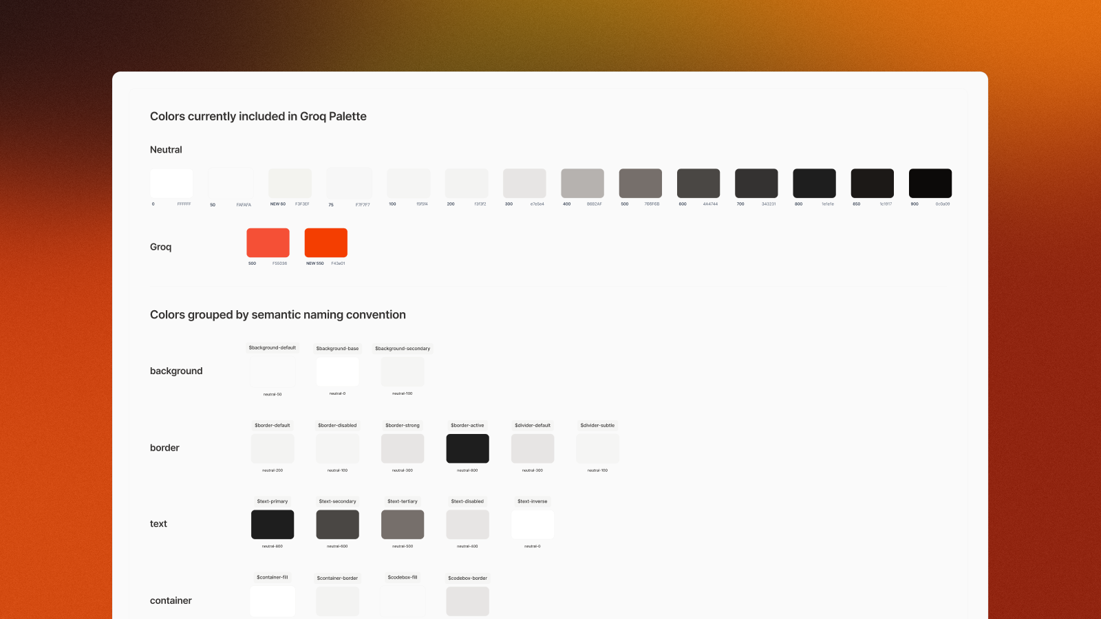
I began by auditing every color in use across the console, to uncover duplicates and near-identical shades which were scattered throughout the codebase. After consolidating these into a streamlined palette, I started to build a Tailwind CSS-based color system with shades from 50-950, while reducing 30 different color conventions down to 14 core values.
To make the system truly scalable, I introduced semantic naming conventions that mapped to the Tailwind palette. Instead of ambiguous names like $neutral-popover-foreground, I opted for more relevant token names, like $text-primary, $text-secondary, or $background-default.
By using these semantic names, it enabled seamless theme switching, because token like $background-default would map to $neutral-50 in both light and dark modes, without requiring any manual overrides.
Keeping with the Tailwind framework, I also defined text styles, split between body and headings, with each style following a text-type-size convention (e.g., text-body-small, text-heading-large). Size, weight, line-height, and tracking were all standardized within this system.
Icons were sourced from the Lucide library, and spacing utilized a consistent scale based on rem units (1 rem = 16px) with tokens like $spacing-04 and $spacing-06.
Components
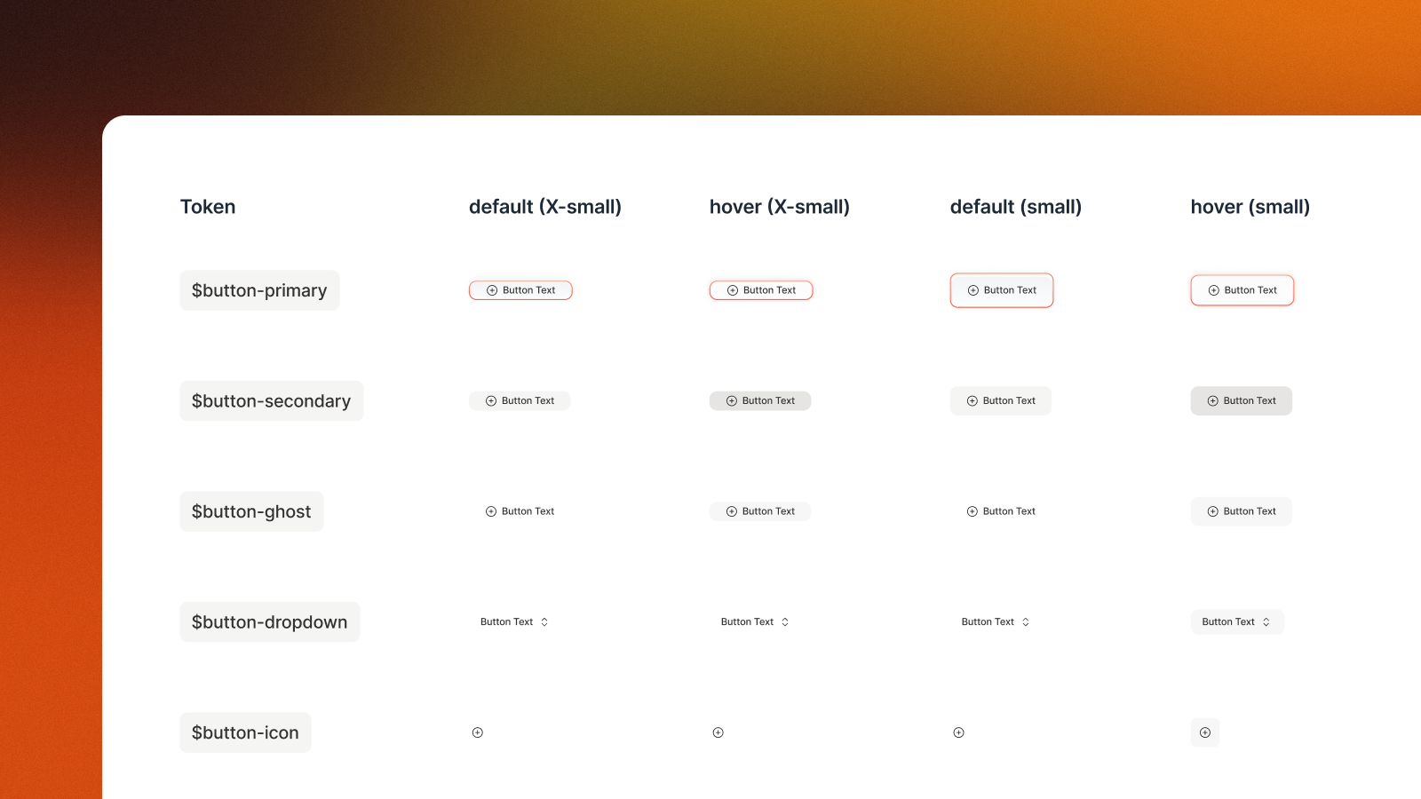
After auditing the console for colors, I went back and identified every repeated UI element that could be componentized. Each component was designed across three sizes (small, default, large), implemented in both light and dark modes, and documented with hover, active, and disabled states.
Many components required multiple variants to cover different use cases. For example, the button component included:
button-primary, button-secondary, button-ghost, button-dropdown, button-pill, button-outline, button-split
Impact
The design system became the foundational building blocks for all new features being built on GroqCloud, enabling both faster design & faster implementation, as well as a more consistent user experience.
Feature Design & Development
Beyond the design system, I also had the opportunity to design a number of new platform features, and even ship a few of them directly:
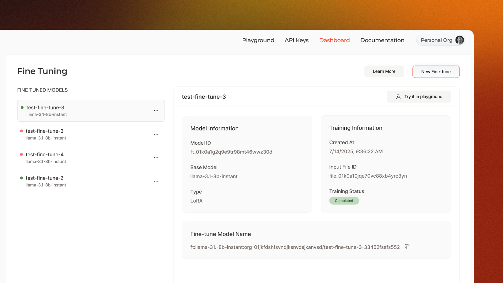
LoRA Management Interface
One new feature was the addition of LoRAs on the console. While I won't go into the reasoning and design decisions here, all decisions were backed by user requirements and data, and went through a number of iterations before being shipped.
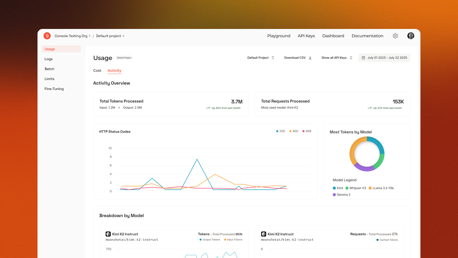
Usage Dashboard
A big pain point on the console was the data (usage) dashboard. This went through a massive redesign, prioritizing better information hierarchy, improved readability and more succinct charts and data visualizations. To design this feature, my manager and I ran a number of user interviews to gather key requirements and define user flows, in order to craft the best user experience.
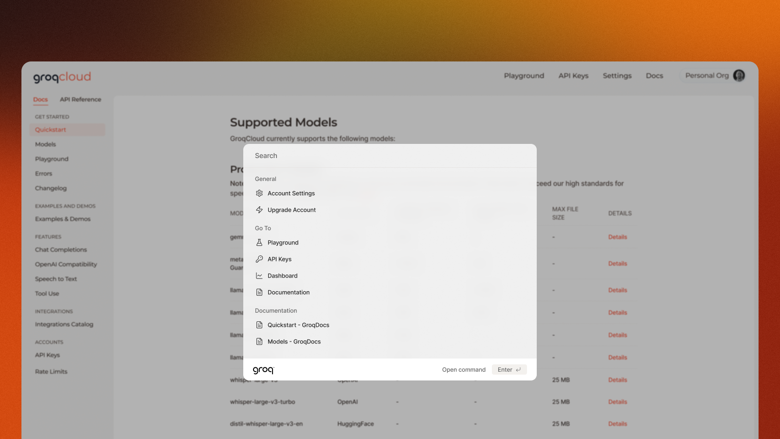
Documentation Search (cmd+k)
While definitely a smaller project, this is one of the ones I'm more proud of. When we added search to the docs pages, it looked very boilerplate and didn't fit the modern design we were striving for. After mocking up a few designs, I decided to take a stab at rehauling the UI (and some of the functionality directly), and ended up shipping my PR directly. This was the first PR I'd ever shipped, and my search modal still exists on the GroqCloud docs pages today :)
Mobile Modal Optimization
A pain point that kept coming up was the formatting of our modals on mobile. Due to the smaller screen sizes, our modals were getting cut off and didn't look great. I went through and redesigned each of modals to be more responsive to ensyre that they looked great on all screen sizes. I also created a new modal component that could be used across the platform, and could be easily styled to match the new design system.
